81: Hot and cold on HomeKit

HomeKit launched in iOS 8 and has operated as a stealth feature for the past two years. It's powerful enough to have Siri control your lights but so invisible that you need to download a third-party app to get it working (some app, any app, not necessarily the app that goes with your HomeKit accessories). This is changing in iOS 10 with a first-party Home app and something I think is far more useful: access to HomeKit scenes and accessories in Control Center.

In fact, the entire third pane of Control Center is dedicated to HomeKit. (I'm not sure what people with no HomeKit devices see there. Blank space?) Devices can be switched on or off with a tap, and further controlled after a hard press or long press. For lights, that means a big sliding dimmer switch, and a button to access another screen for setting color. There you can set up six presets or dig even deeper to access color wheels. One wheel is a standard RGB rainbow, and the other controls color temperature.

If you're familiar with color temperature at all, it's probably from the desktop utility f.lux, which automatically adjusts temperature based on time of day — cooler and bluer during the day, warmer and orangier at night. Color temperature is measured in Kelvin, just like heat temperature, because there's supposed to be a direct correspondence to physical properties of ideal objects at those heats.

In reality, color matching is a mess and 5000K here may not be 5000K there. My Philips Hue bulbs, although boasting their color range on the packaging, never let me directly set a K value; I always have to choose from an onscreen color palette. Their idea of white light temperature goes from yellowy to mildly blue. Apple's, on the other hand, goes all the way to deep orange and deep blue, more Florida Gators than f.lux.

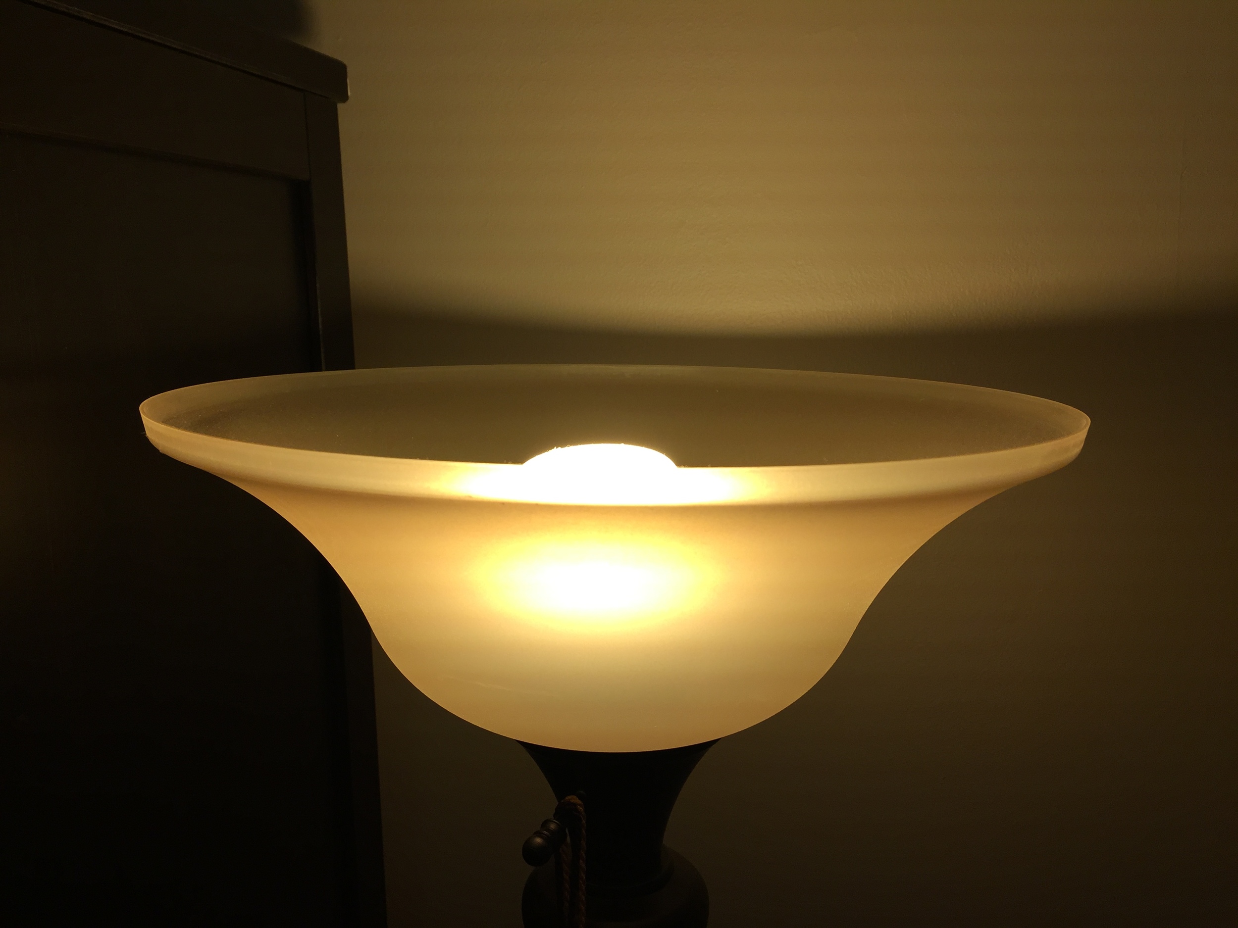
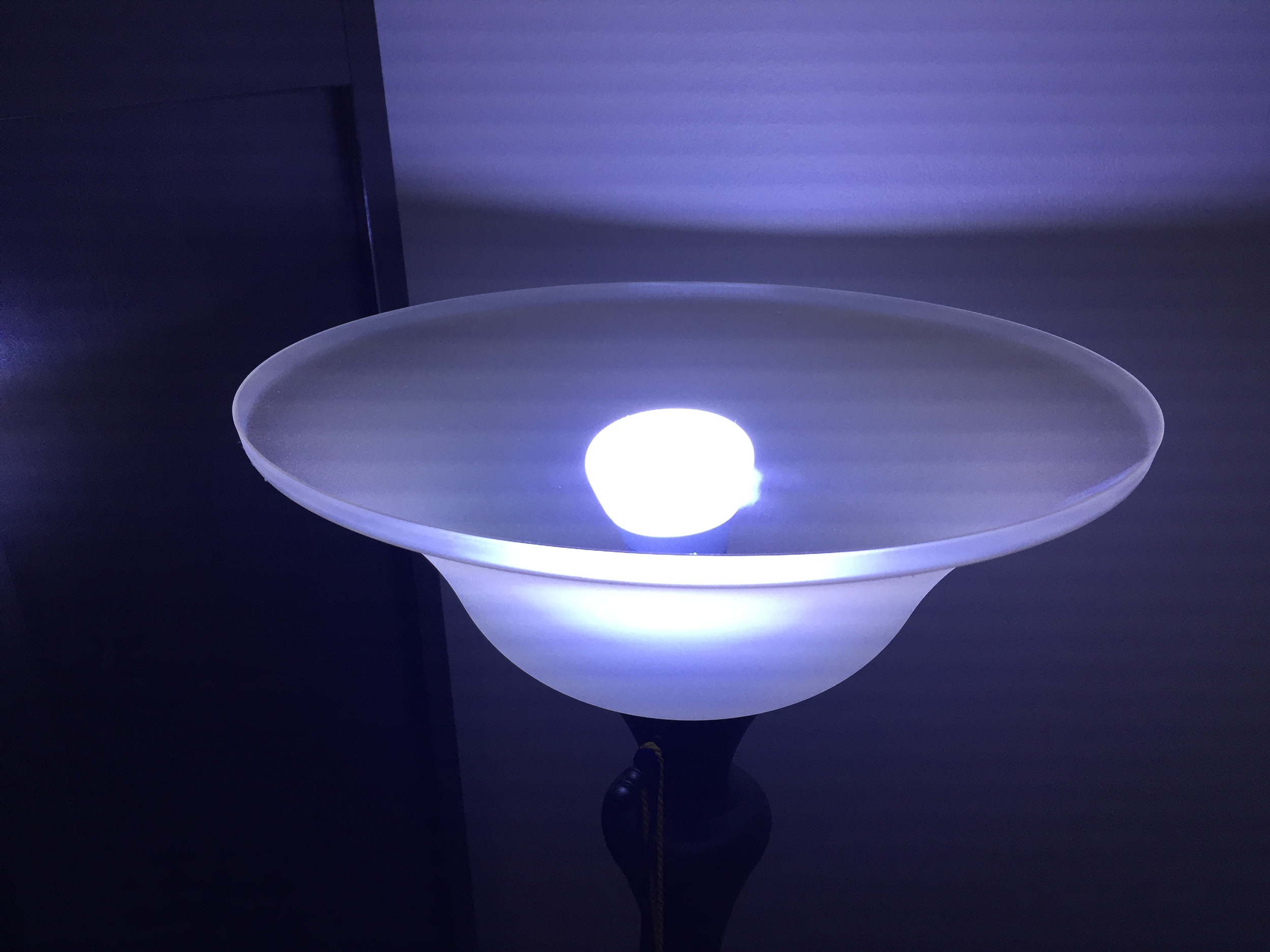
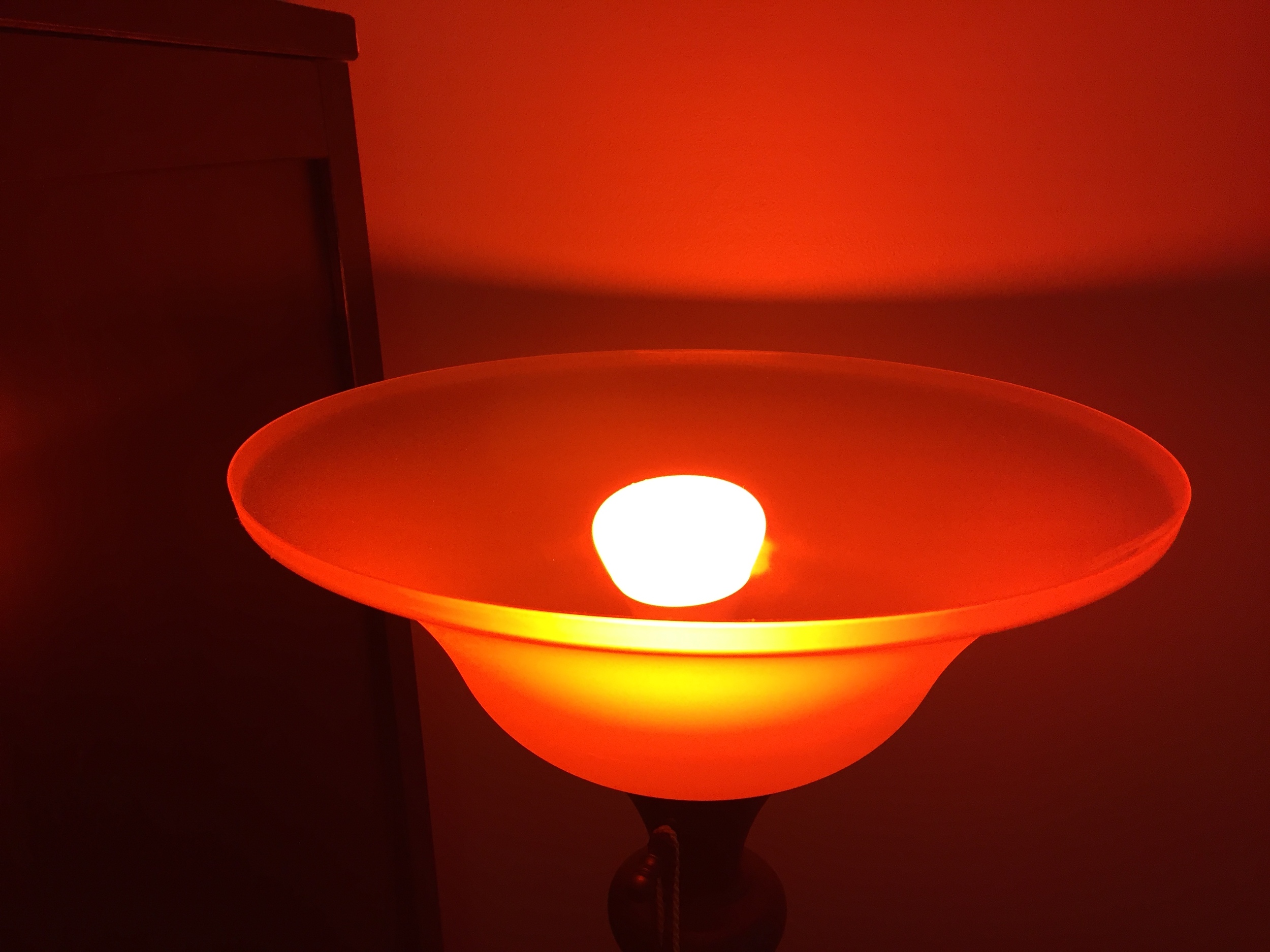
In practice, this means that what I see is not what I get in my HomeKit apps. The same bulb set to the same moderately warm tone can appear onscreen as everything from beige to green!

And I still haven't managed to set a pleasing color that feels white with Apple's wheel. Fortunately, the workaround is to set a good color in another app, then activate Control Center and set the current color to one of the presets. Having done that, HomeKit is now more useful than ever before, especially for things like quietly turning out the lights at night. But even two years in, it still requires a hodgepodge of apps to set things just right.

80: Accessible by design

This is my Pokéjam.

This is my Pokéjam.

iOS 10 hasn't been billed as a major interface redesign, but it's definitely accelerating change away from the ultra-wispy, radically flat design of iOS 7. At the WWDC intro of iOS 10, these changes were demonstrated mainly in two apps: Music and News. When I saw the slides, I thought, "OK, this is an interesting, bold new direction for the interface." When I first used Music, I thought, "Wait, did some accessibility setting get turned on?"

No sooner had I thought that than I realized what it meant. For those of us with perfect vision, hearing, motor skills, etc., Accessibility just looks like the extra-fiddly settings section. But for many, those settings are the only thing that makes their Apple devices usable. I shouldn't be shocked at a slightly larger text size in one of the cornerstone apps on iOS. While I fortunately don't need it yet, I would guess that there are tens of millions of older iOS users who have increased their default text size just because their eyes are aging. Frankly, that means that my expectations were reversed. Nice, large, readable text should be the default — as it is now — with an option for the eagle-eyed to shrink it down to increase information density.

Of course, it's still incumbent upon Apple to arrive at a sensible default, especially if it can't be changed. One area of question is the lock screen. I think it's more or less properly proportioned on the iPhone, but Stephen Hackett recently shared a comical iPad lock screen. He's apparently listening to one of his favorite podcasts, "ow with John Gruber" and the latest episode features "uest Glenn Fleishma". (It also features a bug with the playback indicator and times over one hour, which has carried over from iOS 9.)

On the iPad lock screen, the default is clearly wrong; the average user should be able to read more than two and a half words in that space. I expect a sensible revision there, similar to how the Notes app in macOS Sierra finally has moved in the opposite direction, away from a tiny text default. These are both proof that good design is iterative (and the beta period is the perfect time for quick iteration). The drive behind that design has to be that Apple products are no longer for "the rest of us"; with a billion iOS devices in the world, they're for all of us. Out of the box they should be accesible to as many as possible and, with a few changes in settings, accessible to the rest.

79: Keyboard clicks

Few things in the Apple universe provoke such strong reactions as clicky keyboards, both physical and virtual. Some people demand silence, while others want their clicks to be as loud and satisfying as possible. I vacillate: I've used an Apple Extended Keyboard II this decade, but I've turned off the keyboard clicks in iOS.

Or I had, until I installed the iOS 10 public beta, which restored the default setting, turning them back on. Those with an ear for detail also noticed that the click sound has changed. It's softer, more of a pop than a click, and this too has its supporters and detractors. I like it a little better — it's more subtle and refined — but that's not the reason I decided to leave the sounds on.

I have keyboard clicks enabled on my phone now as a sort of early warning system. There are vanishingly few times when my phone should not be set to silent, especially while I'm at work. The worst way to discover that the mute switch got flipped is by accidentally blasting some silly video from your Twitter feed in the middle of a quiet office. Leaving keyboard clicks on lowers that chance. The instant I hear keyboard feedback, I know to enter silent mode. But the soft pock pock pock sound of the keys, especially just for a few seconds, won't cause anyone around me offense.

I have to draw the line somewhere.

I have to draw the line somewhere.

I employ a similar strategy on the Mac, although it allows me to be even quieter. By default, Mac OS plays sounds when changing the volume using the media keys. This can be temporarily disabled by holding the shift key, or the behavior can be reversed in System Preferences. This lets me quickly tap the mute button to check my current volume without creating any sound. And when I put on headphones and want to do a practical volume check — because three clicks on my Sennheiser headphones is several times louder than three clicks on EarPods — I simply hold shift to get the necessary feedback.

Perhaps my stance on keyboard clicks will just be temporary, and they'll begin to drive me insane. Or who knows, maybe with the new sound I'll come to actively like them. Even then, I would try to keep them confined to my headphones; the goal is still to keep my devices' sounds from bothering those around me.

78: Improved data detectors

I keep an informal running list of potential topics for Picomac. There's one that's been in there for months, but I've avoided it because my opinion just seemed too negative. It reads: "data detectors are as dumb as a box of rocks".

Data detectors have been around for a long time on both the Mac and iOS. They first appeared in Apple's Mail apps, doing helpful little things like highlighting addresses or phone numbers so you could act on them quickly. Those data types made sense for such a feature; if pressed, I could probably write a quick and dirty regular expression that would match them just about as accurately as the detectors do.

But highlighting phone numbers wasn't what provoked my ire. It was the overgeneralization of data detectors into Messages, which led to lots of annoying clutter. In an effort to be helpful, Messages would take phrases like "what are you making for dinner?" and underline "for dinner", offering to create a calendar appointment. I hope the day never comes that I need to make a record of what time I will eat a meal in my own home.

Monday was my first full day with iOS 10 and it was also a rough day personally. I was not up for cooking dinner. I got a text with some suggestions: "We could go to Zingerman's roadhouse or jolly pumpkin or something." The two restaurant names were underlined. (And "for dinner" was not!) I tapped on each name and a full page of relevant info popped up: location, phone number, photos, and other info sourced from Yelp. Dumb old data detectors have grown up. First, they're location-aware; if you're not in Michigan, the words "jolly pumpkin" mean nothing with respect to dinner plans — especially if they're written all in lowercase. Second, they're more subtle; instead of looking like an ordinary hyperlink, the underline beneath the text is thinner and lighter — just enough to signal that you can tap on it.


Highlighting local restaurant names is just one new trick that data detectors have learned, and I expect to discover more. It gives me hope that someday it will be an OS-level feature to perform more complex data detection, like taking an email signature block and automagically parsing it into a full contact card. (That's best done by third-party apps like Interact today.) It's also promising for Apple's ability to do smart things with "proactive" or context-sensitive data on the fly. If data can be detected an acted upon instantly, perhaps someday Siri will no longer have to say "let me check on that" in response to very simple queries. And whatever future data detectors bring, one thing is certain: I won't be rolling my eyes at texts about dinner anymore.